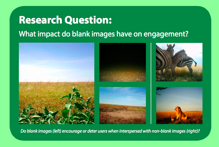
Earlier this year, we wrote about our surprising finding that our attempts to encourage Snapshot Serengeti users to stay longer and provide more classifications, by showing them lots of “interesting” animal images, had actually deterred them. Realising that we must have removed some valuable part of the experience, we deduced that a likely cause might be that we had reduced the number of “blank” images (images with no animals present) seen, and that therefore blank images add value to the user experience, encouraging volunteers to stick around.
In July 2015, we decided to test this experimentally, theorising that the percentage of blank images seen by each volunteer would directly affect the length of time they would stay on the site (their “session length”). In this post I’ll explain the experiment and outline our results and conclusions.
The Experiment
As with the previous “happy user experiment” we used our experimental framework (including Geordi and the Zooniverse Experiment Server) to intervene in the normal process for selecting images that users will be asked to classify; instead of choosing random images, we carefully controlled the percentage of blank images that each user would see.
We randomly divided users between 7 cohorts:
[table id=10 /]
N.B. The reason for not including a 100% blanks cohort was that we did not want to change the fundamental user experience, that this is a task of finding and identifying animals.
For this experiment, we used previously classified images, so that we knew which images were blank and which were not. As each user joined the experiment, our code created a unique image set of 70 images with a defined percentage of blanks according to that user’s cohort. For example, for a user in the 40% cohort, we created a pool containing 28 blank images and 42 that contained animals. As the user progressed through the experiment, new images would be drawn at random from that pool, until they had completed the experiment.
The experiment ran for 3 weeks in July on snapshotserengeti.org, with 1,882 people taking part, generating 4,204 user sessions in total. (A new session begins every time there has been more than 30 minutes since the user’s last classification).
Results and Analysis
One of the first things we did was to carry out a certain amount of cleaning of the data. Since it takes a while to generate each user’s image set, and we did not want to freeze the user interface, we served random images as normal to users both before the experiment set was ready, as well as after the experiment was complete. We also fell back to using normal images when the experiment server or next selected image was not available due to network issues. To ensure that we only looked at user sessions where the percentage blanks was tightly controlled, all these user sessions had to be identified and discarded.
Once this was done, we were left with 1,506 user sessions for analysis.
We compiled percentage blanks, cohort and session length for each user session, and then examined and graphed the data:
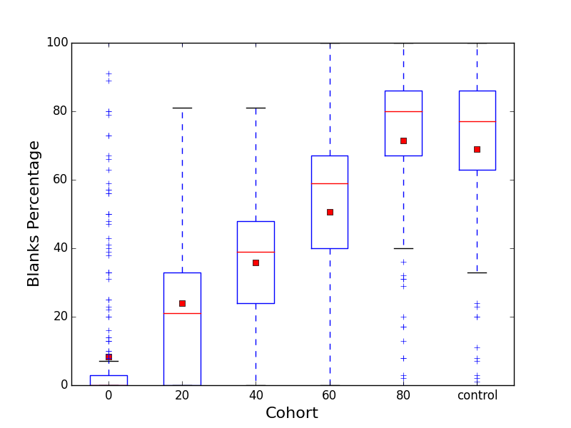
Box-and-whisker plot showing the distribution of blank images across sessions during the experiment
This is a box and whisker plot. The red lines represent the median average for each cohort, and the red dots represent the mean average. The solid box for a cohort shows the values falling between the first and third quartile, and the “whiskers” extend to 1.5 * IQR, with outliers being marked as plus signs.
From this graph we can see that each experimental cohort was correctly centred around a median of 0, 20, 40, 60 and 80% respectively. The control cohort has a natural percentage blanks of around 71%,
This graph also shows one downside of our experimental methodology was that the variance of each cohort was quite wide, and quite disparate. This was a problem caused by short sessions, where a user happened to randomly select a subset of their image pool with a very different percentage than that expected for their cohort (For example, a user in the 20% cohort gets 5 random images, and the first 4 of them happen to be blank, giving this user an effective percentage blanks of 80%). This is something we plan to improve in future experiments.
Nonetheless, the cohorts are distinct enough to proceed with the analysis.
Next we looked at the distribution and averages of session length:
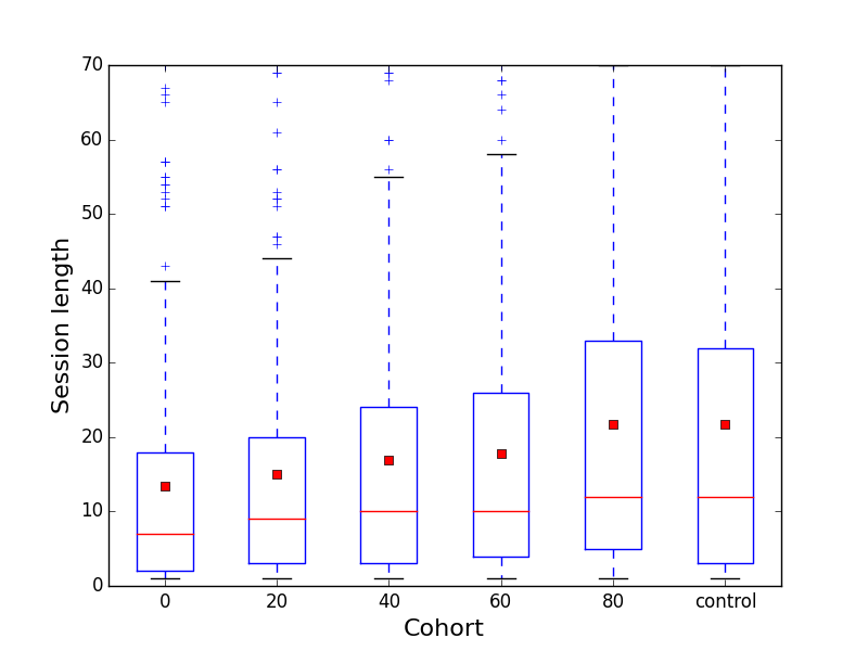
Box-and-whisker plot showing the distribution of session lengths by cohort during the experiment
Here we can see an increase in mean session length as the percentage blanks increase.
This graph shows it more clearly:
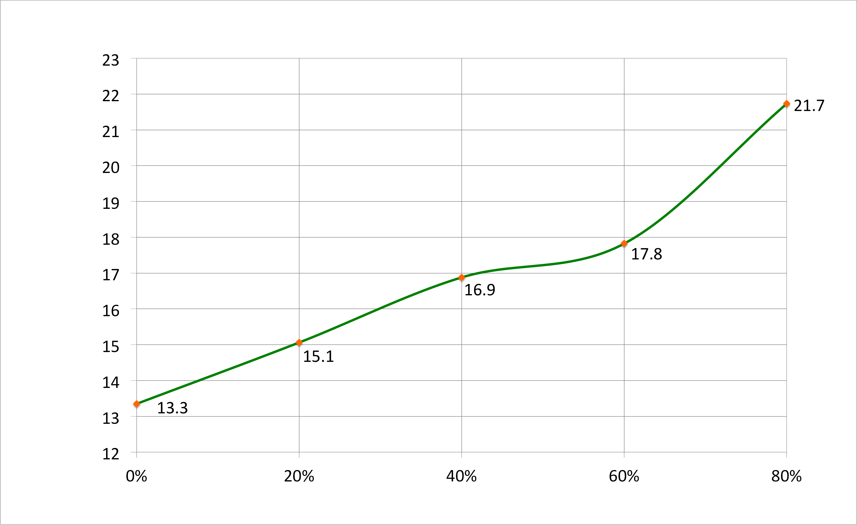
Mean session length (Y) against cohort (X), with smoothing.
From this initial analysis, our theory does seem to hold up – that for cohorts with 0 to 80% blanks, the session length increases in proportion with the percentage of blanks.
The Null Hypothesis
To investigate whether this relationship is true, we proposed a null hypothesis:
There are no differences in mean session length between the cohorts.
If this were true, this would prove that the percentage of blank images has no bearing upon session length.
We then set about trying to disprove this; we used the Kruskal-Wallis test for this (because our data does not have a normal distribution, something that other tests such as ANOVA require).
This test found that the probability that these cohorts come from the same distribution was 0.000015. In other words, p < 0.0001, which is low enough to confirm statistical significance. This provides strong evidence against the null hypothesis.
The Alternative Hypothesis
This lead us to conclude that the opposite must be true, in other words,
The cohorts have different mean session lengths.
To explore this further, we used Dunn’s post-hoc test, a.k.a. the Nemenyi test, to find out exactly which pairs of cohorts have a statistically significant difference between them.
[table id=11 /]
Here we can see some cohorts (marked in green) which have statistically significant differences – the 0% differs from 80% and control, and the 20% cohort differs from the 80% cohort. This provides strong evidence that these cohorts do indeed behave cohesively and differently with regard to session length.
Effect Size
Finally, we decided to examine the effect size of percentage of blank images seen upon the session length of users. We used the Glass Delta technique, which works with data like ours where cohorts’ data have different variances.
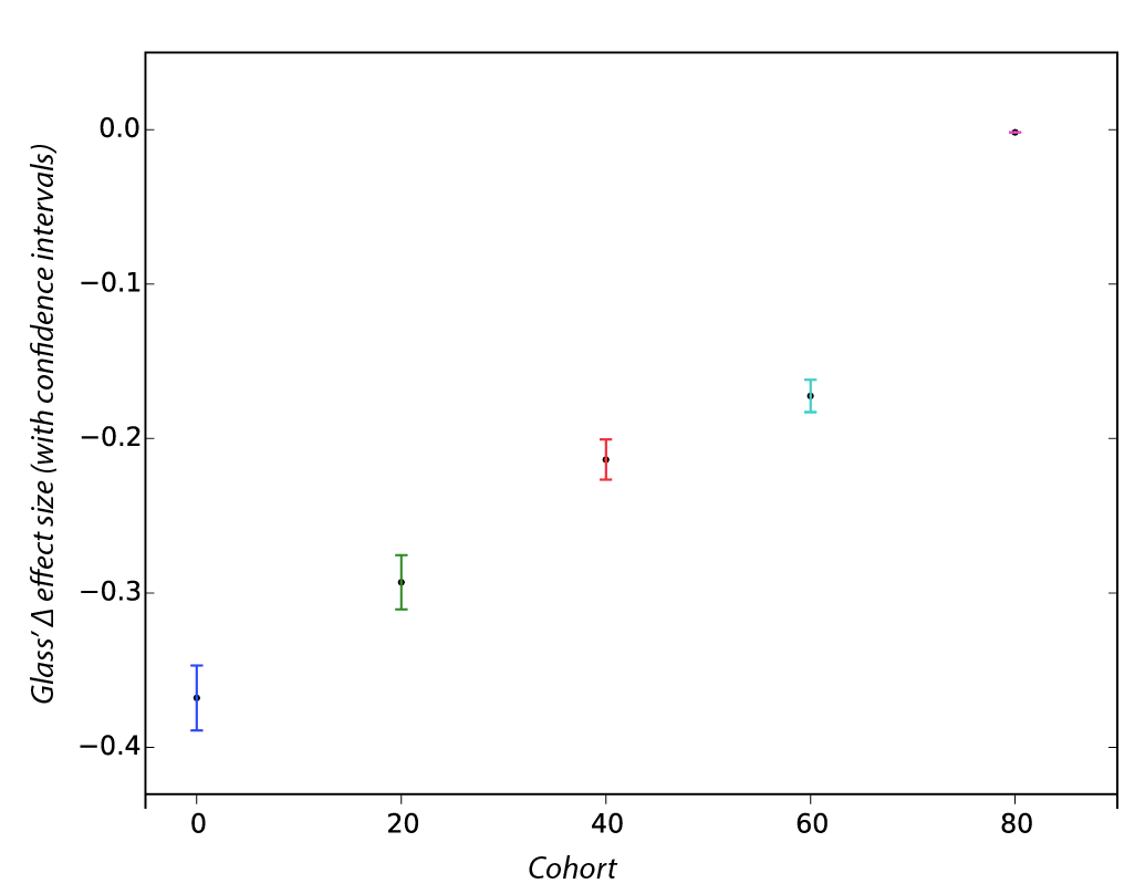
Glass’ Delta Effect Size upon Session Length, with confidence intervals, by cohort
This graph shows the effect size (with confidence interval shown as coloured I-bars) for each cohort. Here we can clearly see a relationship, which seems to be causal, where being present in a cohort with a lower percentage of blanks has a negative effect on the length of the users session. This analysis shows that as you decrease the percentage of blank images a user sees from 80% towards 0%, you will also shorten their average session length.
Summary of Results
What we have shown in this experiment, is that reducing the percentage of “blank” images that a user sees in their session, will reduce the length of time they spend providing voluntary classifications. This is very important for citizen science researchers to understand, since a common approach is to remove blanks in order to optimise for efficiency and not waste volunteers’ time. What we have shown is that optimising for user experience, not efficiency, is critical if each user’s contribution is to be maximised.
Qualitative Support
As well as the data supporting this finding, we have also found qualitative support for the ideas that blanks make users want to keep going. Here are some examples from a recent survey into volunteer motivation on Zooniverse projects including Snapshot Serengeti, with relevant phrases highlighted:
“It’s like panning for gold… Just one more and you will find something interesting.”
“I like looking for something out of the ordinary.”
“There is a certain thrill in coming across a good image on Snapshot Serengeti”
“You click Next and think ‘Just one more…’ but then something interesting comes up.”
“I’ll carry on until I see an interesting one.”
“I never know what animal might show up next.”
All of these quotes from volunteers support the idea that the absence of animals in some images actually makes the images that do contain animals seem more valuable, and that search for value drives them to keep going.
A Psychological Explanation?
Obviously we would like to explain this phenomenon, and so we looked at other research in the study of motivation. Starting with B. F. Skinner’s behavioural research, there have been many studies in the fields of psychology, especially with computer games, gambling and behavioural experiments, that have explored the impact of intermittent reward or reinforcement.
The consensus from this research is that an intermittent, random schedule of reward will yield more prolonged participation, be it a fruit machine that rarely pays out its jackpot, or a loot chest that rarely drops high-spec items. It is this psychological effect that compels gamblers to keep going in search of “just one more win”, and so it makes sense that an understanding of the psychology of motivation will be very important for citizen science researchers endeavouring to maximise the contribution of their volunteers.
The theory is that more “misses” (blanks in our case) make each “hit” (a good picture of an animal) seem more valuable. Rare, unpredictable “hits” motivate you to seek them out and keep going. The task becomes fun, more of a hunt. In our case, an animal seen after a series of blanks gives an immediate payoff – this is the reward in our context – and it is especially rewarding if it is a visually pleasing image or an unusual animal.
Next Steps
This research continues, both in a MICO context and in a Zooniverse context. Some of the avenues we are investigating next are:
- Correlation vs causation – Can we be certain that the blanks cause the shorter sessions?
- Is there a “sweet spot”? (a peak percentage of blanks before and after which the engagement drops)
- Does this relationship between percentage of blanks and session length hold true when we look at our historical records of classifications from the site?
- Do other aspects of the images increase engagement – such as variety, complexity, difficulty, aesthetics, or novelty?
- What happens if we more tightly control the percentage of blanks? Can this be done while retaining the random selection required for causal conclusions to be drawn?
We will report back on this blog as we progress further in this research.
References & Further Reading
For references and more details, please read our work-in-progress research paper and poster, which presented this research at HCOMP 2015. If you have any questions about this research please contact alex.bowyer@zooniverse.org.